Comparing Covid Race Data with Presidential 2020 Voting Data
Nevada was not only a swing state in the 2020 Presidential Election, but one which kept the country waiting for electoral college votes. I want to compare voting data by counties and compare them with covid race data.
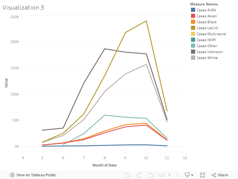
50% of Nevada is white and 28 % Hispanic or Latino. While whites made up 31% of COVID-19 cases, Hispanic or Latino residents made up 48%. And in the summer, positive cases for Latinx people increased at an all time high, at 239,889 recorded cases.
For a story, I would like to investigate why there was such a drastic increase in the summer months, and why it is at an all time high as of this month. Also, when looking at a map of counties, most counties voted red. What turned Nevada blue was its smaller, yet more populated blue counties. Many Latinx communities live and work in these counties. I would love to do a comparison of each county’s votes compared to how they were hit by COVID-19, to see if the virus influenced or did not influence their votes.