Nebraska: Hospital Accessibility and Racial Discrimination during Covid
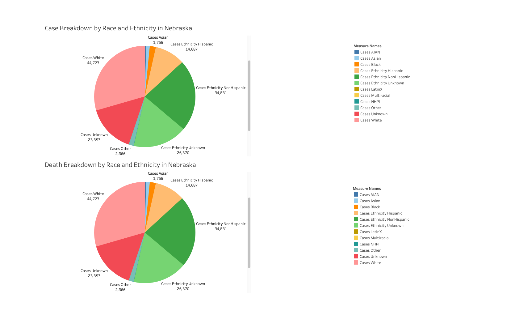
My second visualization presents current Covid Tracking Project data with data from the CDC’s Behavioral Risk Factor System (deleted from visualization in the process of trying to upload data). While per capita and county-level insights would better clarify this picture, I would want to investigate whether Covid case and death trends reflect existing trends in healthcare discrimination in Nebraska, particularly discrimination in affordability and access. It should be noted that the CDC’s data has the glaring omission of Asian, and Asian/Pacific Islander data for Nebraska.
Ideally, I would want to generate a Nebraska Voronoi diagram with plane points based on hospital concentration, displaying regional care affordability and Covid case and death rates by race population. This visualization might draw attention to the lapses of healthcare economic assistance programs like ACCESS Nebraska, whose key performance measures do not account for race and ethnicity despite documented disparity.
I could envision this piece sitting at approximately 1000 words.