Categories
Uncategorized

Elli Garcia Data Sketch 2

Montana reports race for only 53% of COVID cases, which is one of the lowest in the country. I propose a story that investigates which races are being erased by this lumping of race in ‘Unknown’ categories. I am particularly seeing that the American Indian or Alaska Native alone population makes up for 6% of the population, 19% of cases, and 38% of deaths, which is highly alarming.

Potential sources:
Montana Website
Montana State University Website

Categories
Uncategorized

Sydney Fishman Data Sketch 1

For my story on Alabama, I’d like to analyze why the number of Latinx deaths is not accounted for. The deaths of covid for black residents and white residents are accounted for but the Latinx rate is unknown. I’d like to understand what the rate of Covid deaths are for this population, and also understand why there is little data on this group.

For this particular angle, I would interview the Alabama Public Health Department. I would also interview Latinx groups that are documenting COVID-19 in the U.S., such as Salud America.

salud-america.org/coronavirus-case-rates-and-death-rates-for-latinos-in-the-united-states/

I envision the piece to be about 1,000 words, but possibly more if I find info on why Latinx deaths haven’t been accounted for recently.

Categories
Uncategorized

Maureen Mullarkey Data Sketch 1


Like many other states, Nevada’s covid cases unfortunately hit populations of color drastically more than white populations. This graph shows the total number of cases by each race. In Nevada, Hispanic/Latinx alone make up only 28 percent of the population, yet they make up 43 percent of the percentage of cases. Whites alone make up 50 percent of the population, yet make up only 31 percent of the percentage of cases.

A story idea would be to research why this is, perhaps Hispanic/Latinx make up more essential workers, have less access to solid, healthcare etc.

Categories
Uncategorized

Maureen Mullarkey Data Sketch 2


This graph shows all COVID-19 deaths by race in Nevada. While whites make up 50 percent of the populations, and yet make up 51 percent of COVID deaths. Blacks or African Americans alone make up 8 percent of the population, yet make up 12 percent of deaths. Also, Asians make up 8 percent of the population, yet make up 12 percent of deaths.

For a story, I would like to investigate why these racial groups all have death percentages higher than their own population percentage.

Categories
Uncategorized

Maureen Mullarkey Data Sketch 3


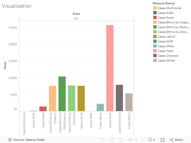
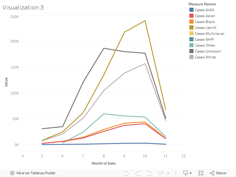
This graph shows the percentage growth of cases by race over time. While positive cases in Latinx communities were always higher than white communities, the Latinx percentage drastically increased in the summer months between July and September. Along with the second wave, positive cases for Latinx people are at an all time high, at 239,889 recorded cases.

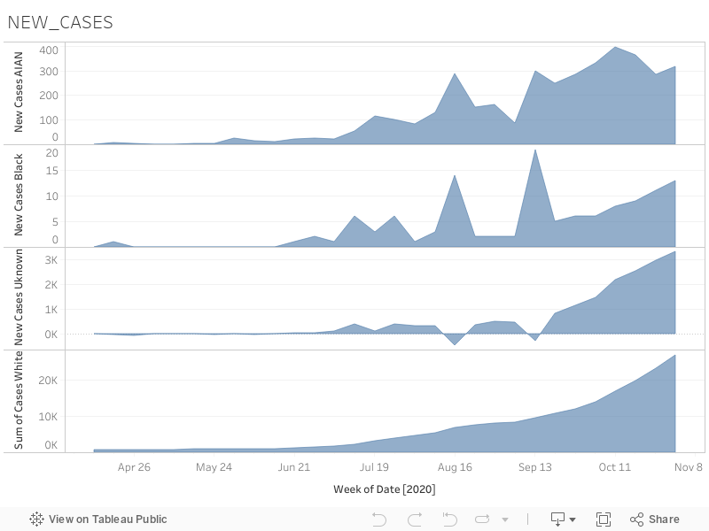
For a story, I would like to investigate why there was such a drastic increase in the summer months, and why it is at an all time high as of this month. Also, since in this election year, the state of Nevada sparked quite a controversy, as it was slow to count votes. When looking at a map of counties, most counties voted red. What turned Nevada blue was its smaller, yet more populated blue counties. Many Latinx communities live and work in these counties. I would love to do a comparison of each county’s votes compared to how they were hit by COVID-19, to see if the virus influenced or did not influence their votes.

Categories
Uncategorized

Amanda Perez Pintado Data Sketch 3

Black Ohioans make up 18% of COVID-19 cases in the state. The COVID Tracking Project flagged the group’s case proportion as suggestive of ethnic disparity due to three criteria: it is at least 33% higher than the Census Percentage of Population, it remains elevated whether the project includes or excludes cases with unknown race or ethnicity and it is based on at least 30 actual cases or deaths. It is no secret that the novel coronavirus has disproportionately affected Black, Native American and Latinx communities across the country. I would propose a story focusing on the social and health factors that disproportionately affect Black Ohioans and contribute to the large proportion of COVID-19 cases in the state.

Word count: 1,500

Potential sources:

  • Testimonies from Black residents who have tested positive for the novel coronavirus or families who have lost a loved one
  • Ohio Department of Health
  • Social epidemiologists
  • Advocacy groups
Categories
Uncategorized

Amanda Perez Pintado Data Sketch 2

The number of COVID-19 deaths in Georgia have noticeably dropped across races and ethnicities since last month after going on an upward trajectory since April 2020. I would propose a story that takes a closer look at measures and actions taken by the local government that contributed to this new downward trajectory in deaths. I would also look to answer the question why it took so many months to finally see a significant drop in deaths.

Word count: 1,000-1,200

Potential sources:

  • Georgia Office of the Governor
  • Georgia Department of Public Health
  • Georgia Hospital Association


Categories
Uncategorized

Amanda Perez Pintado Data Sketch 1

Georgia has categorized over 2 million cases of COVID-19 in the state’s ethnic and racial breakdown of cases. I would propose taking a closer look at who these unknown persons are and get a sense of what groups they belong too. I would also take a look at which counties have been reporting the most “unknown” cases.

Word count: 800-1,000

Potential sources:

  • Georgia Department of Public Health
  • National Statistics Office of Georgia
  • Georgia Hospital Association
Categories
Uncategorized

Sam Krystal Data Sketch 3

California: Who Do You Call “Other”?

California has the highest count of “Other” Covid cases in the country. It is not immediately clear why California’s unknown rates are so high – I would like to investigate how California defines its “Other” category compared to other states with high counts of “Other” cases. Additionally, I would like to represent each Californian county’s case breakdown by race, to see if a specific county or region’s collection methods or policies are accountable for California’s “Other” case rate. Concurrently, I would like to investigate which communities are not being properly reported by being reported as “Other” and would try to collect and visualize as much data on that topic as possible.


I could envision this piece sitting at approximately 1500 words.


Potential Sources:

  1. State-level health data taxonomy policymakers
  2. County-level health data reporting agencies
  3. ACLU California
  4. California Department of Public Health
  5. APM Research Lab
Categories
Uncategorized

Sam Krystal Data Sketch 2

Nebraska: Hospital Accessibility and Racial Discrimination during Covid

My second visualization presents current Covid Tracking Project data with data from the CDC’s Behavioral Risk Factor System (deleted from visualization in the process of trying to upload data). While per capita and county-level insights would better clarify this picture, I would want to investigate whether Covid case and death trends reflect existing trends in healthcare discrimination in Nebraska, particularly discrimination in affordability and access. It should be noted that the CDC’s data has the glaring omission of Asian, and Asian/Pacific Islander data for Nebraska.


Ideally, I would want to generate a Nebraska Voronoi diagram with plane points based on hospital concentration, displaying regional care affordability and Covid case and death rates by race population. This visualization might draw attention to the lapses of healthcare economic assistance programs like ACCESS Nebraska, whose key performance measures do not account for race and ethnicity despite documented disparity.


I could envision this piece sitting at approximately 1000 words.