A better user experience keeps readers coming back
User experience (UX) design can lead to better news products for diverse digital audiences.
Getting the who, what, when, where, and why down in an article may not matter if the page takes forever to load. And a beautifully shot video won’t be seen if it’s broken up with distracting and irrelevant ads.
That’s why news organizations need to focus on user experience (UX) design to improve the ease of use, convenience, and enjoyment that audiences feel when interacting with their digital news products. Digital newsrooms are increasingly thinking about good UX design as a path to increased engagement, virality, and customer satisfaction.
In order to please audiences, news executives need to understand what they want. Good user research includes testing products and studying audiences to better understand how to meet their needs and solve their problems.
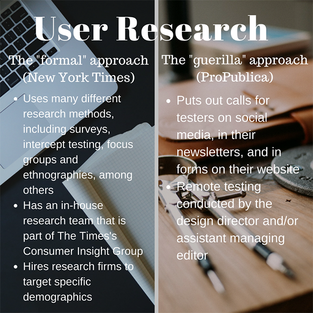
The approaches to user research may vary depending on differing newsroom cultures and goals. Two broad strategies, according to the Nieman Journalism Lab, are the “guerrilla” and “formal” approaches. The New York Times’s “formal approach” incorporates research methods like surveys, focus groups, and ethnographies. ProPublica has tried the “guerrilla approach,” which includes putting out calls for testers on social media, in its newsletters, and on its website.
Personalizing news websites to users’ needs is a proven way of increasing their unique value. This can be especially useful for organizations with paid-subscription-based revenue models, like the Financial Times, which derives about 60 percent of its revenue from subscriptions.
In October 2016, the Financial Times rolled out its new user “customized” website and reported a 20-30 percent increase in “engagement” and an uptick in the time users spent on the site. The Financial Times boasts that it has built “one of the fastest” sites in the world, with desktop page load times of 1.5 seconds and 2.1 seconds for mobile.
A number of pioneering digital news organizations are demonstrating that enhancing the UX design of news and advertising content can pay off.
Take the examples of The New York Times’s interactive series on the Rio 2016 Olympics, The Fine Line; The Wall Street Journal’s interactive sponsored piece, Cocainomics; and the Guardian’s crowdsourced interactive, The Counted. These show three different approaches to combining multimedia, interactive tools, and text with an uncluttered style to deliver an informative and pleasurable experience.
Content accessibility should be a key concern, especially for digital newsrooms looking to develop new audience segments or, like Vox, focus on explainer journalism. Both user research and UX design can help newsrooms understand the consumption and engagement habits of new audiences.
The fact that news audiences are increasingly consuming their news on mobile phones and social media platforms has forced newsrooms to use UX approaches to adapt their content to suit these emerging channels. For example, AJ+, a millennial-geared start-up launched by the global Al Jazeera Media Network, optimizes video for social media channels.
AJ+ figured out early on that the Facebook video autoplay feature was an opportunity to captivate distracted audiences by “front-loading” its most compelling visuals. The channel also developed a video titling style that allows audiences to watch entire AJ+ Facebook videos with the sound turned off. AJ+ gambled that arranging news content into different kinds of interactive “cards” would better reflect the “contemporary browsing logic” of its 18-30-year-old target demographic.
As AJ+ demonstrates, the way to build and maintain an audience is to keep close tabs on what users want and need to come back.
Here are six lessons from successful digital news UX strategies:
- Start with audience/user research.
- Design news websites with the user in mind.
- Create interactive news and advertising products.
- Personalize and explain the news to improve its accessibility.
- Tailor news content for users on social platforms.
- Tailor news content for mobile users.
Key quotes
Everything has to start with the user.
News outlets should be careful not to assume the audience has prior knowledge on a topic or particular story, as this can affect how accessible content is.
I think it will be foolish to organize our work around devices — a desktop product versus a mobile product — and instead we must organize it around the person.
We designed these ‘stacks of cards’ to incorporate various content types per news item. One card contains video, the second provides a forum for discussion, the third features infographics and the final includes interactive elements such as quizzes.
Simple is hard. Easy is harder. Invisible is hardest.
Why is this important?
News organizations need to provide unique value, convenience, and pleasure to digital users in order to survive in a social and mobile-first world.Killer links
- Nielsen Norman Group When to use which user-experience research methods
- Financial Times Introducing the new FT.com
- Nieman Journalism Lab How AJ+ makes its videos stand out
- Journalism.co.uk How Vox, AJ+ and FOLD are using cards for storytelling
- Econsultancy 11 examples of crappy UX from news websites
- Tom Greever 5 examples of bad UX from major brands
- Eastern Standard Concepts 5 user experience sins you just accept every day
People to follow
-
 Yaser Bishr is the global executive director of digital media at the Al Jazeera Media Network.
 -
 Raju Narisetti is the CEO of the Gizmodo Media Group.
 -
 Martin Belam is the social and new formats editor at the Guardian.
 -
 Chris Messina is the guy who invented the hashtag.
 -
 Luke Wroblewski is a product director at Google.
 -
 Aarron Walter is the author of 'Designing for Emotion'.
 -
 Nick Finck is a product design manager at Facebook.
 -
 Sanette Tanaka is a product designer at Vox Media.
 -
 Gregg Bernstein is the senior user researcher at Vox Media.
 -
 Matt Raw is a product design director at The New York Times.
 -
 Barbara deWilde is a lead UX strategist at The New York Times.


